How Color Psychology Empowers Marketing
Table of Contents
Colors are everywhere around us. Each color we see evokes a specific emotion within us. They hold the power to influence us.
More than 90% of the people in the world decide to buy a product based on its color. That’s why knowing color psychology can seal the deal for your business in terms of marketing. Let’s debunk what brand color psychology is and how it influences your marketing strategies.
What is Color Psychology?
Psychology is the study of your mind and how it influences the behavior of a person. Color psychology is the same but with colors. It gets into how different kinds of colors can affect your behavior and emotions. Subtle usage of hues or tints in a corporate brand design is often overlooked but contributes greatly to selling the product or service.
Now imagine a fast food restaurant. What color immediately comes to mind? Is it red? Why? Because red is the go-to brand color for fast-food chains. It creates a sense of energy, excitement, and urgency among the viewers.
The most popular fast food chains McDonald’s and Burger King both have red in their logos. These brands have mastered brand color psychology to improve their marketing efforts. You can too.

How To Use Brand Color Psychology to Improve Marketing
Various famous brands from Coca Cola using red as a fun and energetic color to IBM using blue in their logo to instill trust and provide a sense of security. The right kind of branding isn’t just limited to content marketing and search engine optimization.
Brand visuals play an equally crucial role in attracting your consumer’s attention. To achieve that, you need to choose the right visual, text, and color. You can do that by keeping the following things in mind:
Give your brand color a personality:
Every brand color you see has its very own personality and paints a relevant picture in your head every time you view it. For example, when you see a brand using "yellow", your brain immediately associates it with vibrance. For black, you think of luxury. So, use a color that resonates with your brand's values and offerings.
Create a proper and cohesive color palette:
Your brand's color palette complements its identity and gives it the visual appeal it needs. Choose a color scheme of your choice—complementary, analogous, or triadic.
Experiment with color combinations:
Don't back away from experimenting with colors to find out what works for your business. You can use any of the above color schemes to create impactful designs. Complementary marketing colors will grab attention, analogous ones will create color harmony whereas the triadic colors will create vibrance. However, this can be a little tricky if you're not familiar with color theory. We'll cover color theory later on.
Always test and iterate:
Conduct A/B testing to know how effective your color choices are. You can track metrics like click-through rates, user engagements, and conversions. Get started with A/B testing by posting two different color psychology designs and comparing their performance to see which works better for your brand.
Breakdown of Colors and Their Meaning
Every color holds differing values, evokes different emotions, and influences people in different contexts of a brand’s niche. Both Coca-Cola and Target use a bold red in their logos serving different purposes. Coca-Cola’s red sparks excitement and energy whilst Target’s red signifies affordability and also this unique choice of color sets it apart from other retailers. Here’s a breakdown:
Red color in psychology is a high-energy color that stimulates your nervous system.It can also create a sense of urgency and excitement, making it the ideal color for calls to action or limited-time offers.
Coca-Cola's iconic red cans have been an icon of refreshment and happiness for decades. The bright red color evokes feelings of excitement, energy, and pleasure, making it a powerful tool for attracting the viewer's attention.
The green color in psychology is calming and relaxing and is known for reducing stress and anxiety. We often associate it with nature, growth, and harmony. This color is a popular choice for brands that promote health, wellness, and sustainability.
The Whole Foods Market uses green as its primary color, representing its commitment to environmental conservation.
Orange is a sparkly and high-energy color that stimulates the nervous system and increases excitement levels. Similar to yellow, we associate it with enthusiasm, friendliness, and creativity.
When I think of the color orange in a brand, the first thing that comes to mind is Nickelodeon's orange logo. The orange color offers excitement, making it a perfect choice for brands that want to appeal to children and young adults.
Black is a powerful and mysterious color that gives off a sophisticated, elegant, and authoritative vibe. Black color in psychology is often associated with luxury, power, and mystery. It is a popular choice for brands to create a sense of exclusivity and prestige.
Chanel's black and white logo is popular for being associated with luxury and sophistication. It is often associated with sophistication, and power, making it a popular choice for brands that want to project a premium image.
Being preferred by a majority of the world's population, blue is a calm and soothing color. Blue in psychology is often associated with trust and reliability. This makes it a popular choice among brands that wish to build a relationship with their consumers.
BlueDarts blue and green logo is easily recognizable as we associate it with reliability and efficiency. The blue color gives a sense of trust, stability, and professionalism, which is important for a company that majorly relies on the timely delivery of packages.
Yellow is a cheerful and optimistic color that is sure to boost your mood and increase your energy levels. Yellow color in psychology is often associated with creativity, intelligence, and warmth, making it popular among brands that want to promote innovation and evoke positive emotions.
IKEA's bright yellow logo is instantly recognizable and it makes us think about affordability and fun. This makes it highly popular among brands that wish to cater to and attract a younger audience.
Purple is a sophisticated and mysterious color that makes us think of royalty, luxury, and wisdom. It is a color associated with creativity, spirituality, and intuition. Brands choose this color when they want to promote innovation and individuality.
Cadbury's purple packaging is instantly recognizable and associated with luxury and indulgence. Businesses that want to brand themselves as premium or high-end generally opt for this one.
White color in psychology is a pure and clean color that can evoke feelings of innocence, purity, and simplicity. It can be easily associated with cleanliness, perfection, and peace, making it a popular choice for brands that want to promote health and wellness.
Apple's white products are instantly recognizable and associated with simplicity and modernity.
How to Choose the Right Color for Your Brand
In marketing, colors are the easiest way to influence consumers and convey what your brand is all about. But you need to be mindful of using the right color that aligns with what your business has to offer.
Oftentimes the business colors you use may not be the right choice. Here’s how you choose the right color for your brand:
Emotional resonance:
Does the color you've opted for evoke the desired emotions and feelings for your brand? Does it align with your brand's personality and messaging? For example, if you have a luxury jewelry brand, you might choose a color like gold or purple that conveys sophistication and elegance.
Brand recognition:
Is the chosen color memorable and easily recognizable? Does it help your brand stand out from your competitors? A strong color association will make your brand more memorable and recognizable among others.
Target audience appeal:
Does your color resonate with the target audience? Does it align with their preferences and cultural background? For example, if your target audience is young adults, you should choose a color like blue that is associated with trust and reliability, and liked by a major audience.
Consistency:
Does the color complement your brand's other visual elements, such as logo, typography, and imagery? Your brand color needs to be used consistently throughout your brand's materials to create a cohesive and unified look.
To pick the right color that ticks the above checklist, you need to understand the basics of color theory for your brand.
Understanding Color Theory
To understand color theory, you need to be familiar with the following concepts—color wheel and color harmony.
Color Wheel
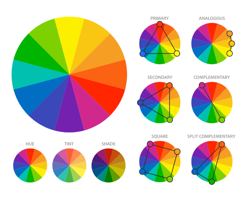
The color wheel in brand color psychology is the same as it sounds–a wheel of colors. It is a circular arrangement of colors that shows their relationships and interactions. It’s a foundational tool in color theory. It gives you a visual representation of how colors are connected and how they can be combined successfully.
Primary Colors: Red, yellow, and blue are the primary colors. They exist independently and cannot be created by mixing other colors. They are the building blocks of all other colors on the color wheel.

Secondary Colors: Orange, green, and purple are the secondary colors. They are formed by mixing two primary colors
Orange:
Mix of red and yellow.
Green:
Mix of yellow and blue.
Purple:
Mix of blue and red.
Tertiary Colors: Tertiary colors are created by mixing a primary and a secondary color.
There are six tertiary colors:
Red-orange:
Mix of red and orange.
Yellow-orange:
Mix of yellow and orange.
Green-yellow:
Mix of green and yellow.
Blue-green:
Mix of blue and green.
Violet-blue:
Mix of violet and blue.
Red-violet:
Mix of red and violet.
Color harmony is the pleasing arrangement of colors in the wheel. It’s the art of selecting and combining colors in a way that creates a visually appealing and harmonious composition. There are various common color harmonies, with their own characteristics and effects:
Analogous:
These colors are adjacent to each other on the color wheel. Analogous colors create a harmonious and soothing effect. They are often used in nature and can be found in landscapes, sunsets, and flowers. Examples of analogous color combinations include blue, green, and yellow, or red, orange, and yellow.
Triadic:
These colors form an equilateral triangle on the color wheel. Triadic colors generally create a vibrant and dynamic effect. They are used in advertising and marketing materials to attract viewer attention. Examples of triadic color effects include red, yellow, and blue, or orange, green, and purple.
Split-Complementary:
These colors are a variation of complementary colors where one of the complementary colors is replaced with its adjacent color. Split-complementary colors create a less intense contrast than complementary colors while still providing a visually interesting effect. Examples of this combination include red, green, and yellow-green, or blue, orange, and red-orange.
Tetradic:
These colors form a rectangle or square on the color wheel. Tetradic colors create a complex and dynamic effect. They are often used in sophisticated and artistic designs. Examples of this combination include red, green, blue, and yellow, or orange, purple, green, and red.
Conclusion
Brand color psychology is a powerful tool that can be used to strengthen your marketing efforts and create a memorable brand experience. By understanding the psychology of different colors, you can communicate your brand’s message efficiently and evoke the desired emotions.
Ready to unlock the power of color psychology marketing for your brand? Reach out to our Graphic Design agency for visually stunning designs that resonate with your target audience and drive results.


