Recent Post
-
 WhatsApp Business Marketing: The Most Underrated Growth Tool for Small Businesses in 2026SEO
 -
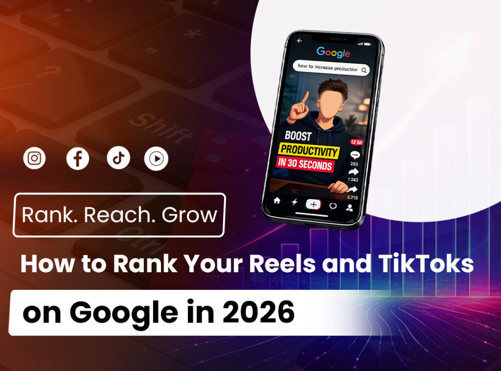 Short-Form Video SEO: How to Rank Your Reels and TikToks on Google in 2026SEO
 -
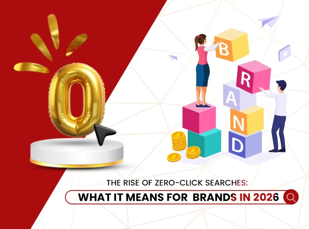 The Rise of Zero-Click Searches: What It Means for Brands in 2026SEO
 -
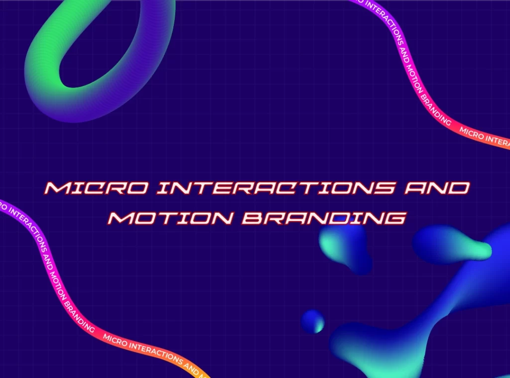 Micro Interactions and Motion BrandingSEO
 -
 Digital Transformation for Small Businesses: A Step-by-Step Guide to Building Your Online PresenceWeb Development

10 Key Reasons Major Brands are Investing in Consistent Branding for Greater Impact
Branding might look like an outfit game. But statistics and success stories say there is more to it. More than just a mere grooming, branding is all about selling stories, core values, ambience and nostalgia.
But what does consistency have to do with branding?
Here is a scenario,
Just imagine Van Gogh is reincarnated in 2025 , and you get to meet him. But alas,
He is a graphic designer with track pens instead of brushes and a palette, Wears a hoodie and a beanie instead of a straw hat and a country outfit, And sadly, vape took over the old classy pipe!
Here is the question: will you be convinced that he is the legendary Vincent van Gogh?
It is not impossible, but indeed it is hard; in fact, the idea of Vincent, as rooted in our memory, doesn’t resonate with his modern version at all. Due to this contradiction, it surely marks a conflict in our minds.
The same effect applies in branding also– it’s a brain trickery, a pattern-based recognition. That is why brand consistency is an essential factor for a brand’s success and longevity.
Table of Contents
What is Brand Consistency? ( and Why is it Important)
Brand consistency is the process of shaping a well-defined ‘persona’ for your brand. How important is it?
It fulfills the purpose of communication and interaction with customers. And so it connects the brand to the customers, with a strong emotional and personalised identity—something of a raw flair that speaks the core values of the brand.
Another interesting thing about brand consistency is that a single iconic element might symbolise the whole brand. For example, Nike’s check symbol.
Can you imagine the Terminator (by Arnold Schwarzenegger), advocating for a Bubble gum brand? It doesn’t check out much since it feels more robotic and less human.
How to Maintain Brand Consistency?
Consistency maintenance is an ongoing process. It is the act of ensuring that the brand ideals and communications are received by your audience in their proper identity. Think brand as a personality– with a unique charm, characterized vocabulary, specific style, choice of outfit and its colour, etc.
In marketing terms, these elements– the props and aura— are termed as:
- Website design
- Visuals
- Colour scheme
- Typography
- Tone of the brand
- Micro interactions
- Brand ideals and core values
So the brand consistency should be definitive, without any touch points going off beat. It’s like carefully configuring each element while not letting any of them down.
Do you know that 60% of millennial consumers expect brands to be consistent across different platforms? (Source: RenderForest)
What is Brand Reputation Management?
Brand reputation management is the process of configuring and maintaining the way you want your brand to be seen or perceived by customers. It requires monitoring, tracking the performance and making the necessary steps to improve the brand reputation as well as brand consistency.
How Successful Brands Ensured Consistency Across All Touch Points.
The success behind those famous brands that still holds their ground is not sheer luck or fleeting trends. If we look closer, the whole brand establishment and its sustenance will be uncovered. Let’s unwrap how major companies have moulded their brand identity and maintained it over time.
Brand identity is a collective impression shaped by all its elements, not by a single factor alone.
Visual Branding Consistency
Let’s reconsider van Gogh again. His Starry Nights, one of the most celebrated impressionist artistic movements, is a perfect example of visual impact on audiences. Visuals are a more realistic medium for communication. It embodies colour psychology, geometrical aspects, spatial dynamics, ambience and lighting.
In short, visuals are a strong choice of communication that, when targeted with a clear composition, they are enough to convey a whole lot of message without saying anything at all
Graphics
The role of graphics is a pivotal factor that can act as carriers of your brand propaganda. More than its decorative purpose, graphical elements set the ambience and the pictorial mood of your brand.
- 94% of first impressions are design-related– (Source: Northumbria and Sheffield Universities via K.Cavender Design)
- People form a first impression within 50 milliseconds based on visual design. (Source: Google Research Via CXL Institute)
Examples:
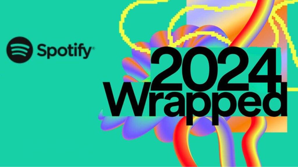
Spotify‘s Visual Identity
Viscous and fluid graphics add a remarkable identity to Spotify. Such blobby and gooey structures induce a feeling of dream-like or surrealistic appearance. Such graphics also invoke a sense of organic shapes, the best choice for an ambient music streaming platform
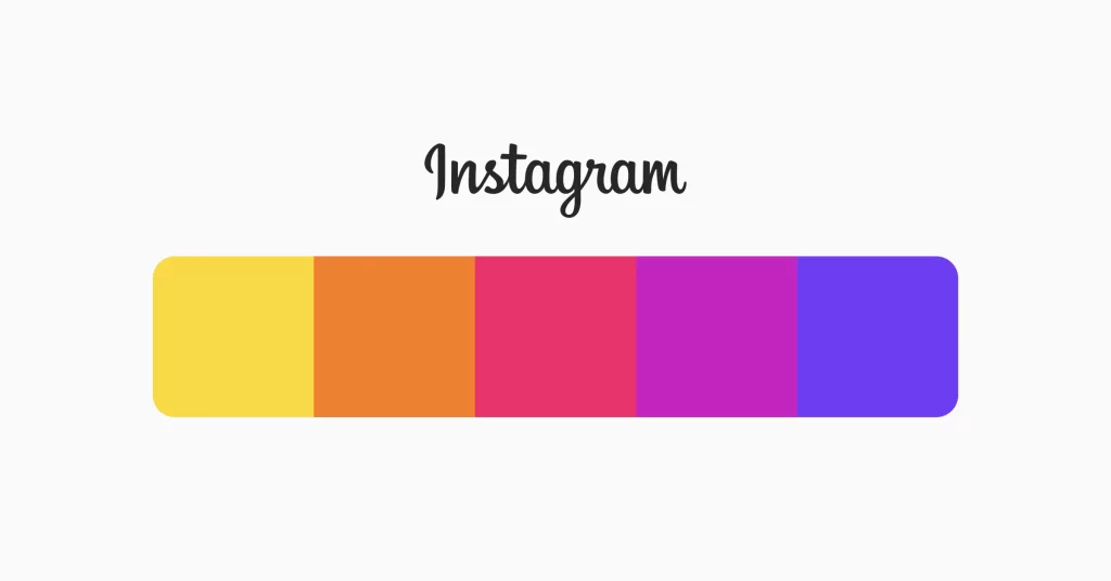
Instagram Expressive Blending of Gradients.
Instagram has a strong graphical theme, which is characterised by expressive colours, blended with gradient elements. The colour schemes that go from pink- orange-yellow-purple are intentionally blended with gradient and flow. Like Spotify, Instagram’s graphical ambience is also based on non-rigid visual languages.
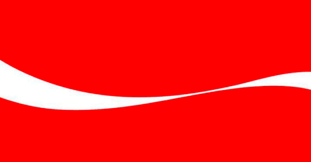
Coca cola’s Dynamic Ribbon
Coca-Cola’s dynamic white ribbon, appearing down its logo, has a whooshing effect that resonates with the swirling effect of the energy drink. It has a streamlined, wavy appearance, which is helpful in creating the eccentricity of the drink.
Logo
A logo is a brief extract of the brand, carrying an in-depth idea of the brand name, aesthetics and core values. Logo is configured by its font style, colour and the overall design. In short, it is the face and the flag of the brand!
The psychological impression of a logo is analysed with semiotics—a field that focuses on the interpretations of symbols and scripts.
- 26% of adults are more likely to trust a business if its branding or logo is familiar to them. (Custom Neon)
- The human brain processes visuals 60,000 times faster than text, making logos crucial for quick brand recognition. (Linearity)
Examples:
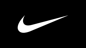
Nike
Nike’s logo is not just a symbol, it’s a presence. It’s through a mindful branding strategy that they went mainstream with just a bold, curved swooshing symbol. The checkmark invokes a pessimistic appeal that encourages confidence, motion and premium quality.
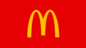
McDonald’s
Yes, you’re loving it. There is no other reason for McDonald’s worldwide reputation. Those M-shaped golden yellow arches denote appetite and authentic taste. It also has a playful element when the red and yellow colour comes into the whole picture
Apple
The bitten apple is a symbolic representation of futuristic minimalism. It stands alone and is noticeable without the necessities of any intricacies. Apple’s logo with notable silhouette appeal provokes luxury and elegance through minimalism. As a part of open interpretation, apple also signifies the Genesis story that links to Adam and Eve
Colour schemes
If visual images are the face of brand identity, colour scheme is its soul. The choice of colours acts like a plane canvas– a plane where graphical elements breathe and live. Colour schemes have enormous power to influence and persuade the subconscious. That is why colour psychology is a deep topic.
- Between 62% and 90% of consumer decisions are based on colour alone. (Source: University of Winnipeg)
- Consistent visual branding can boost recognition by up to 80% (Source: Forbes)
Examples:
Meta (Formerly Facebook)
Colour schemes: Blue + white
Blue, according to colour psychology, symbolises trust and stability. Historically speaking, blue is a colour that is a derivative of hope, success and confidence. While white stands for innocence, purity and divinity, the Facebook colour combination invokes a rich and stable presence
Coca Cola
Colour scheme: Red + white
For energy-based beverages, the red colour is a strong indication for induced appetite, excitement, energy and dynamics. When intertwined with the cleanliness of white, the Coca-Cola brand identity becomes more refreshing and sound.
Netflix
Colour scheme: Red + Black
Netflix has adapted the memorable Red and Black combination for a strong theatrical feel. As a streaming platform, this colour scheme reinforces a premium appeal to browse through entertainment content, giving an immersive cinematic experience.
Tone of Voice Alignment with Target Audience
The tone is the heart of your narratives and expressibles. Whatever it is expressed through words, whether it is your brand motto, taglines, description or catchy advertisement devices, the meaning and the intention are delivered through its tone and not through its technical meaning.
These carefully composed, that resonate with a brand’s customer approach and goals have a deep impact on the audience on a personal level.
All successful brands use strategic language devices, often called rhetoric– the artful use of language to persuade and to evoke specific emotions.
- Brands that maintain a consistent tone of voice across all platforms experience an average revenue increase of 23%. (source: FasterCapital)
- Consistency in brand voice can lead to 33% higher revenue growth. ( Source; VedaDigital)
Examples:
Nike- “Just Do It”
A perfect example of action packed and concise motivational tagline. It reflects Nike’s commitment to providing high-performance sports deliverables to bring the best in you. The tone is intense and powerful, which has become the iconic line of Nike.
Apple- “Think Different”
“Think Different” reflects Apple’s sheer innovation and ideals. It adds a special charm to the brand while also boosting its striking technological approach, showcasing a solid foundation for brand consistency through language and tone
L’Oreal- “ Because you’re worth it”
Directly conveys a strong, empowering and aspirational tone towards the audience. The tone is packed with confidence and luxury that links beauty to self-value. Evokes a strong sense of personal value to the audience.
Clear and Consistent Messaging Across Channels
Every brand’s communications, executed through various platforms, like social media and multi-channel marketing platforms, have to be made consistent or unified with the brand’s authentic style. It includes:
- Messaging
- EMail Marketing
- Personalized online review response
- Post-purchase interactions
- Transactional Feedback.
- Offers and discounts
- Seasonal messaging for festivals
Typography
Style and aesthetics of your font choices and textual formats can be a good medium to convey things beyond words. They impart a rich character to the words and tone, giving a memorable appearance to the text content. Let’s see how various font styles are to strengthen brand identity and consistency.
Examples:
Coca-Cola- Spencerian Script
(custom script)
A font style that instantly evokes a sense of classic nostalgia and sophisticated flow– a font that radiates energy and elegance. Coca-Cola has been maintaining the same font style despite their timely brand refinements, building a strong brand consistency.
Spotify-Circular
(modern sans-serif)
“Think Different” reflects Apple’s sheer innovation and ideals. It adds a special charm to the brand while also boosting its striking technological approach, showcasing a solid foundation for brand consistency through language and tone
Netflix- Netflix Sans
(custom sans-serif)
A sleek, modern and cinematic font that boldly expresses the title, trailers and previews of content. Netflix has a proprietary font that makes the brand stand out among other popular streaming platforms.
Branding is the art of giving a personality to your business. All major global brands consolidate their unique identity through labelling, colour schemes, product demonstrations and taglines. Timely brand reaffirmations can help fortify the brand and improve the presence of your business.